

What is wordmark design, and how do graphic designers create wordmarks for companies? Creating a wordmark is much more than just throwing together a couple of colours and shapes. Graphic designers must take into account many aspects such as typography, colour and imagery. Every attribute needs to come together to convey an idea or meaning which is tied to the brand. They all need to come together in a harmonious manner. The wordmark must not only be visually appealing, but retain and convey the company’s brand identity of the company’s brand.
A satirical news media website called “The Onion” has created a website brand and wordmark which accurately conveys their brand identity and relates significantly to the type of content they supply.
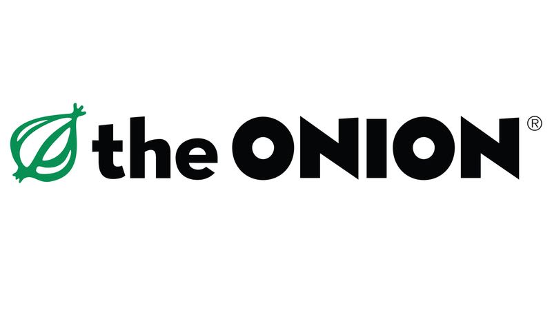 They are a news-themed website and newspaper which features comedy articles on fake news topics. Their wordmark logo font style and the onion symbol in the wordmark both retain and convey their brand identity. They chose a more playful font which is similar to the font used in Disney’s Monsters, Inc. The O’s r very bouncy looking, resembling a ball which creates the idea of youth and play. They used a vibrant green to convey a playful vibe, like the grass found on school fields and parks that are used to play on. The actual name of their brand was most likely chosen because of the onion’s symbolic meaning. Onions are known to make you cry, and when you laugh at something funny, you might start to tear up. This is one perfect example of a unique and precise wordmark design.
FedEx is another corporation with a well-thought-out wordmark design. They are described by Wikipedia as a “multinational courier delivery services company” which was first called Federal Express. They later changed their company name to something more simplistic and easier to remember. Changing it to FedEx did just that. The wordmark they have created is simple and conveys a clear meaning.

They are a delivery service company and, like most companies, they needed a wordmark which would be eye catching, and easy to remember for consumers. Their design appears simple, but contains some subtle elements. FedEx has used a bright colour like green, which contrasts nicely with purple to better stand out. They have used a font style with straight sharp lines to convey precision and speed. That translates into what they supply as a company, which is efficient and reliable deliveries. Their wordmark also contains an arrow in the negative space between the E and X. This might have been done to relay that their deliveries, head straight to their consumers without delay. The arrow has also been aligned with the centre of the e and the d, both of which have been brought down ever so slightly to create that alignment. FedEx’s wordmark is distinct and displays ingenuity in the form of their aligned arrow and lowered d, and it also depicts the central ideas of their company’s services which is fast a reliable deliveries.
Another news-based media website called the Vulture has a wordmark demonstrating the diversity and intelligence that their website supplies. They provide reviews and articles on pop culture topics around music, movies and TV. They have a lot of content surrounding celebrities in the film and music industry. Their wordmark includes the slogan, “devouring culture.” The graphic designers use shadow, font, paint and colour manipulation to convey their brand identity.
![]()
One interesting feature in their wordmark is the shadow effect they added to Vulture. The way it fades resembles the shadow that lights form when blocked by figures. This feels like a relation to the lights that are shone on music artists and actors when they are being filmed. Vultures are creatures who devour and scavenge for food. In the case of their website, “vulture” relates to how they search for content and stories around contemporary pop culture.They have chosen a blue background against their slogan, “Devouring Culture.” The choice of this bright vibrant blue relates to the bright and intelligent artists which their website features. Their slogan’s background is also shaped as the stroke of a paint brush that has just painted a canvas. This relates to the creativity and artsy side that comes into play for celebrities that work in film and music. Vulture has also been curved upwards resembling the curvature of a globe–Vulture has articles on material from places around the world, not just North America.
Graphic design takes a lot of planning, creativity and ingenuity. Every brand has a different message that they are trying to convey. The brand’s wordmark is a representation of their corporate image in its most simplistic form, all the while being able to portray the main attributes of their brand identity.

0 comments on “Wordmark design and brand identity”