

Family road trip turned AI takeover, Mitchells vs the Machines released to select theaters on April 23rd, 2021, before its streaming release on Netflix a week later.
Besides the interesting blend of the two tropes, the film looks impressive from an animation standpoint.
Fans of Sony Pictures Animation know this isn’t the first time the studio has gone out of its way to deliver a refreshing take on CGI, as some methods used are similar to those in Spider-Man: Into the Spiderverse. Some techniques are familiar, such as the use of a lineart effect surrounding characters.
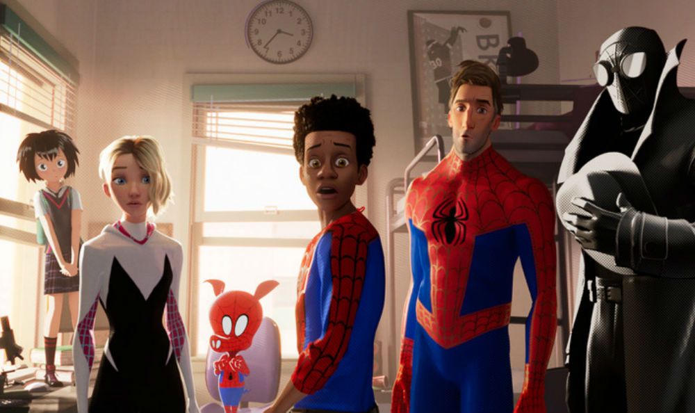
The style is not a complete replication as Spiderverse leans more towards a comic book style as a callback to its source while Mitchells is filled with fabric textures and doodles that could be found in a teenager’s notebook, reflective of one of the protagonists. A key plot element that is reinforced throughout the film is that the Mitchells are not a perfect family, far from it even, with many imperfections which are shown in the messy and hand-drawn painterly style with outlines more visible in some scenes than others.
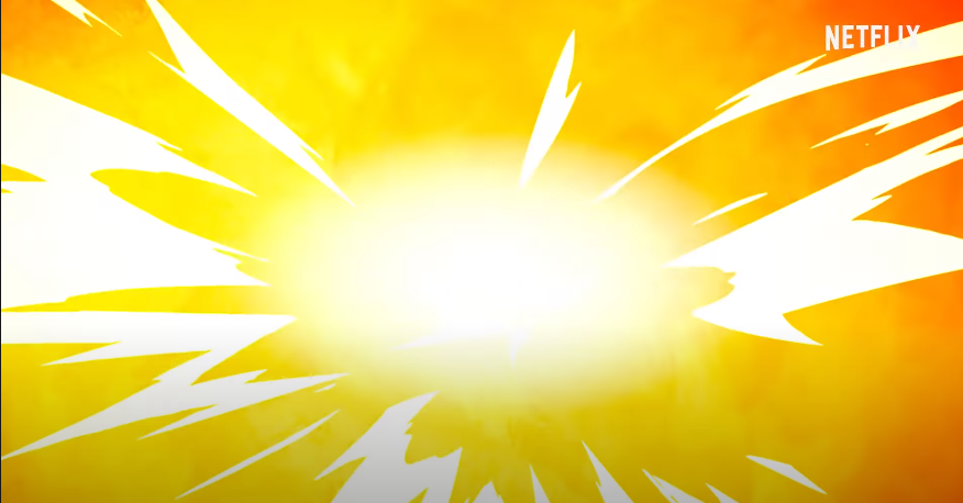
One aspect that stuck out to me specifically was during a scene where the Mitchell family had been fighting off evil robots in an empty mall. As one of the robots exploded I noticed during the split-second it was onscreen that the explosion (along with the ones that followed) had been animated entirely in a two-dimensional art style with solid colors and cell shading.
This movie is experimental and expressive, throwing everything at the wall and seeing what sticks. Such significant strides are being made in comparison to earlier Sony movies, from Open Season released in 2006 all the up to The Emoji Movie in 2017.
The “messy” style is in complete contrast whenever a scene featuring the story’s main villain and her robots is displayed.
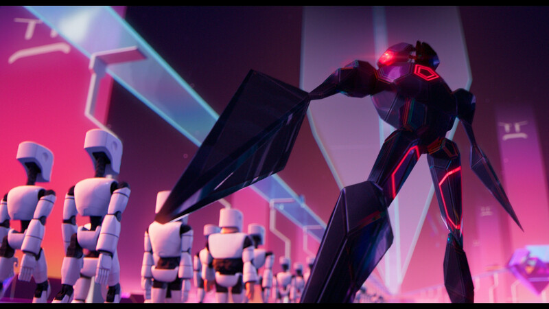
The style is sleek, smooth, and corporate with no imperfections that make the other scenes so much more lifelike.
Less interesting and far from lifelike animation is found not only in these scenes, but also in recently released Ghibli film Earwig and the Witch.
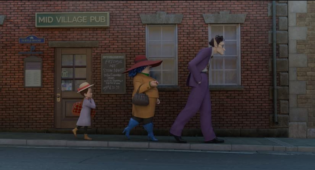
Studio Ghibli is an animation film studio that despite being based in Asia, has become so iconic in the western audience that it is often put on the same pedestal as Pixar or Disney. This success is the result of a culmination of aspects that make each release so special, but one of the largest factors is their animation. At its core the style is anime-oriented, but with so much detail and flair that it feels uniquely personal. Whether it’s because of the change of filmmaker, the switch to CGI, or the inexperience of those working on it, Ghibli fans were vocally unimpressed with the overall look of the film. CGI as a medium was new for the studio but no experimentation was done, the textures appear plastic-like and are exactly what we’ve seen from dozens of other films in the past.
Missteps like this only highlight why the unique animation in Mitchells is something to be celebrated.
The animation featured in Spiderverse received plenty of well-deserved praise in how it was able to draw inspiration from the comic books it was based on, but here it’s taken a step further. The art direction is inspired by the story itself which means there was nothing to take direct reference from except for the brilliant artists and their creativity and passion for the project.
With a sequel for Spiderverse set for 2022, we can only hope other popular studios take a page out of Sony’s book and break out of their formats to give us something distinct and unforgettable.
Cover Image: Sony Pictures

0 comments on “The Unique Artstyle in The Mitchells Vs the Machines Shows Off Techniques We’ve Never Seen Before”