

For this illustration I attempted to create something that enhanced the narrator’s youthful tone. Baskin Robbins may not be a prominent setting in the story however, I illustrated a scene around it to evoke nostalgia, which would then create a connection between the article, the illustration and the audience. Contradictorily, the characteristic colours of Baskin Robbins are toned down and earthy tones were added but this was to help the readers to further immerse themselves in the setting of the story which was around fall. Following the theme of my illustration, I also opted for more simplistic, rounded character designs and imperfect lines that were reminiscent of children’s books. The characters are also placed in a way that created urgency, foreboding the future events that happen in the story.
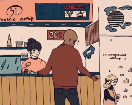
One of the struggles I faced while illustrating for this article was capturing the essence of fall because of the colour pallette of Baskin Robbins. The predominant colour of the brand was a vibrant shade of pink and blue, so it was quite challenging to find a colour was still reminiscent of the brand. As I was trying out mixtures of colours, I wasn’t satisfied the way the colours were; I wanted the colour to be lighter–or a different shade of pink that didn’t remind me of pepto bismol–however, by doing this, it reminded me less and less of Baskin Robbins. I realize now that I could have compensated for this by scattering “Baskin Robbins Fall Promos” throughout the illustration.
I also attempted to change my drawing style to fit the voice of the narrator; however, this proved to be easier said than done as I found myself reverting to my usual drawing style. While this may sound like a good idea I scraped it because of time restraints. Instead, I opted to draw in an art style that very similar to mine but with less detail. However, I later realized that this may the reason why the drawing seemed a little empty. My artwork usually requires minimal colouring, I may add minimum amount of shading if I’m feeling a little adventurous, but that’s because there’s already a lot of detail or textures in the first place.
The style of drawing that I chose for this illustration desperately needed depth of colours. Most of my inspirations for this art also had little to no shading and the excitement of colouring digitally made me forget about these factors that seemed obvious. In my future projects, I think it’s a good idea to get other people’s opinions in order to make sure that my intentions are coming through and also to make sure that it’s illustrated to the best of my abilities.
Not to sound overly negative cynical but honestly speaking I’m not satisfied with this particular piece. While the characters’ dynamic may make up for their lack of detail, the illustration looked fairly empty. In the future, I will be more mindful of how the elements play into my illustrations, so that I could make necessary improvements with the help of criticisms. It seems as if there are endless things to learn about drawing and I mean this in the best possible way. Lately, I’ve been trying to include more background and variety in my artwork instead of drawing the same things that I’m comfortable with. I don’t expect that I will be satisfied with all the artwork that I produce; I will inevitably run into more obstacles however I’m glad that I could learn and improve by taking on these projects.

0 comments on “Artist’s Statement [“Grandpa”]”