

My goal for this illustration was to portray the intangible emotions that comes with feeling inadequate. This is represented through the character’s posture; his hands placed over his face, his shoulders hunched up seemingly trying to make himself smaller and his “creation” dripping from his hands, enveloping his character. The colours were limited to black and white to emphasize the contrast between him and his inner struggles. Furthermore, the addition of the hands were meant to amplify the tension and represent the metaphorical “army” that was mentioned in the poem. At the same time, the supernatural element adds a certain playfulness, as such the audience are not reminded of negative experiences but rather appreciate it as simply an interpretation of literature.
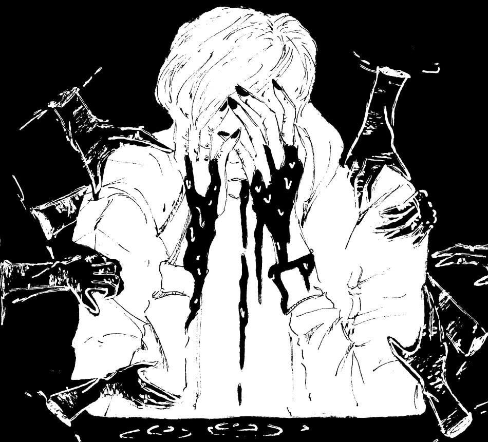
The poem, “Inadequacies” is a devastatingly accurate depiction of the inner struggles most of us could probably relate to. So, I approached this project by taking inspiration in from the feelings that I’ve felt when I’m in the same situation. Through this method, I decided that a monochromatic colour scheme would be fitting as the poem uses a lot of repetition. For instance the limited colour scheme insinuates the monotonous worldview a person develops while going through a lot of pressure and dwelling with the same problem over and over. This also emphasizes the contrast between the character and his inner turmoil. Additionally, the darkness dripping from his hands suggests that he created the situation that he has put himself in.
However this also prompted an opportunity for me to project too much of my personality on my illustrations. This isn’t necessarily not a bad thing but this becomes a problem when the final product depicts a different image or understanding of the author’s original intention. Due to constructive criticism I received, I realized that I’ve failed to interpret a significant element in the poem; the narrator acknowledges his inadequacies and faces them with this calm demeanor. It maintains a cool and tension-filled atmosphere throughout and this emotion was implied through this line: “I sit, frozen as a block of ice facing an impenetrable wall”. This could be improved by putting less detail on the hands and drawing them delicately to make the scene less erratic, which would then be more accurate to the original material. The character could also be staring straight ahead with an impassive face to represent the atmosphere of the poem. Next time, I will be more mindful and consult them on my drawing before I do anything permanent, this way I will be able to accurately adapt the original material into an illustration.
There were other obstacles that I faced while creating this illustration such as the white gel pen conflicting with the texture on watercolour paper and the never-ending attempts of transfering my illustration digitally while still preserving its monochromatic colours. However I can easily say that I enjoyed working on this project the most because I could add unrealistic elements (i.e. the hands) whereas, in other projects including these elements would look misplaced. Illustrating for an article meant that I was limited in the content, I could include so I was ecstatic when I was assigned to illustrate for this poem. Poems are generally ambiguous, so this meant that I had more freedom with the elements that I could include in the illustration. Hopefully in my future ventures I will be able limit on my much of my personality is projected into my illustrations and improve on the areas that I am still lacking on. Although, for now I can say that I am fairly happy with the content that I have produced and thankful for the amount of improvement that I’ve achieved illustrating for “8forty.”

0 comments on “Artist’s Statement: “Inadequacies” Illustration”